In the article ahead, you’ll see how Dighton-Rehoboth Regional School District rebuilt unity and trust with a community-built strategic plan, consistent messaging and a unified district brand.
If you ever find yourself at the local Cow Chip Festival in Dighton, Massachusetts, there will likely be a lot to take in—and we don’t just mean the smell. Maybe you’ll join the crowd watching cows drop “chips”—also known as manure—on a giant grid for a chance to win “cow chip bingo,” or watch budding lumberjacks compete to see who can chop wood the fastest. And if you make it to the end of the night, you’ll be rewarded with a brilliant display of fireworks.
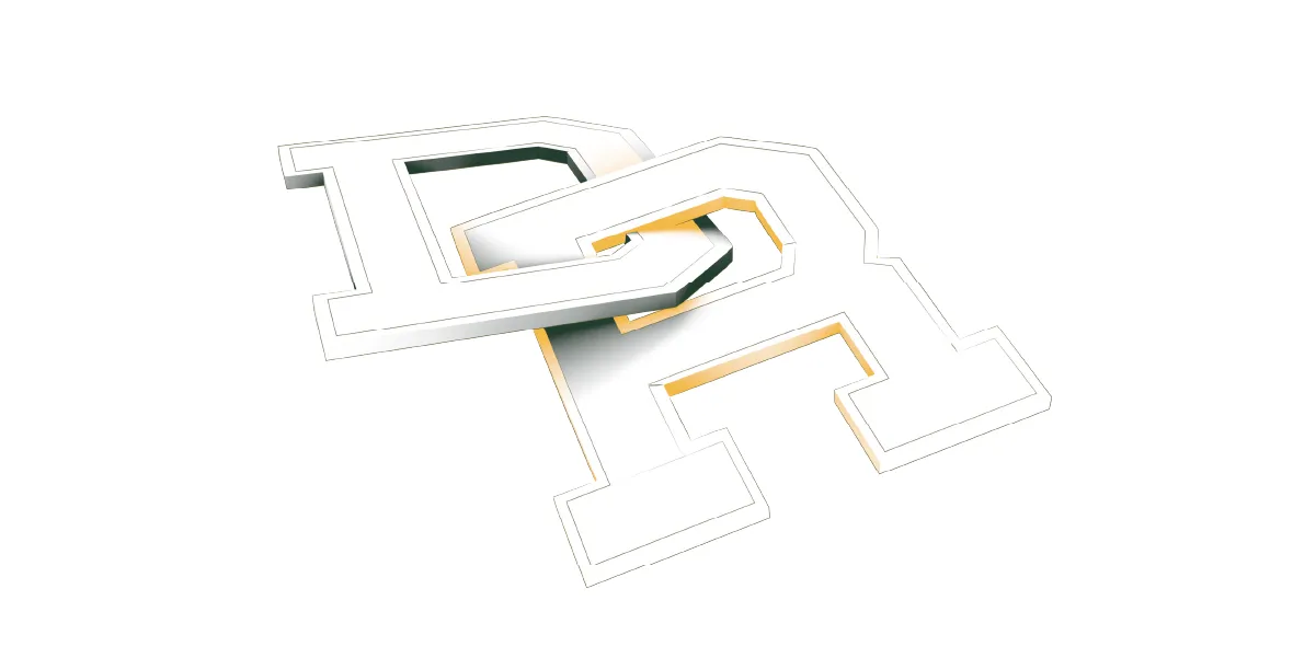
But in the middle of all this, you may also notice an attention-grabbing symbol on signs and clothing throughout the festival: an interlocking D and R in gold and green. It’s more than a logo; it’s the physical embodiment of the unification of the Dighton-Rehoboth Regional School District.
When District Identity Breaks Down
Unlike many school districts peppered across rural America, Dighton-Rehoboth is not a result of recent consolidation. The district itself was formed following Massachusetts’ Regional Schools Act of 1949—the goal of which was to provide stronger opportunities for students in rural towns. In the decades that have followed, however, this hasn’t always felt like the reality for the citizens of Dighton and Rehoboth.
With the small town of Dighton situated less than five miles from the larger agricultural town of Rehoboth, you wouldn’t expect too much of a cultural divide. Both towns share similar demographics and history. But their shared school district has long been a point of contention, something that bubbled to the surface in a bid for it to split into two after the state took over Dighton-Rehoboth’s budget in 2019.
Amid its legal and financial troubles, the district had cycled through relentless leadership turnover for eight years. It was rare for a central office administrator to complete their three-year contract before seeking greener pastures. The district’s only high school had also lost a third of its enrollment in a few short years—a catastrophic decline for a district serving just 2,500 students total. Confidence in the high school had deteriorated, and families were increasingly choosing alternatives.
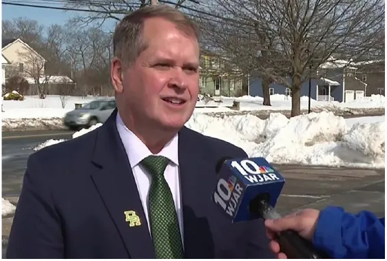
It was in this environment that Bill Runey interviewed to become Dighton-Rehoboth’s superintendent. He now laughs that even seasoned educators questioned his judgment. “It had a reputation as a place you didn’t want to work,” he tells SchoolCEO. “When I was offered the position, a leader within the Massachusetts Association of School Superintendents asked me, ‘Are you sure this is where you want your first superintendency to be?’”
But Runey, coming off a successful 10-year tenure as principal at nearby Attleboro High School, spotted potential. “I told them I saw something in Dighton-Rehoboth that really could be rejuvenated and brought back to the way things used to be,” he recalls of his finalist interview. It was a risky pitch that required that the hiring committee acknowledge their district's serious problems—but it worked. Runey took the helm in July 2022.
From Community Input to "DRiving Toward 2030"
The district’s challenges weren’t just about surface-level issues like finances and leadership turnover. If you looked deeper, they were about more intangible things: identity and connection. “At first, people were telling me that the towns hated each other,” Runey says. “But over time, I determined that it was less about the towns not liking each other and more about the fact that they didn't really care for the district.” When Runey came in, Dighton-Rehoboth didn’t have strong relationships with the leaders of either town. There was little collaboration or communication with local entities like the police and fire departments. In short, the district’s disconnection from Dighton and Rehoboth had weakened the towns’ relationship to each other.
So Runey’s first year focused on creating what the district desperately lacked: a shared vision, drawing on input from community members in both towns. “The last substantive mission and vision work had been done around 2008,” Runey says—15 years in the past. “We really didn't have any North Star to turn to.” He rallied stakeholders from both communities to sit on committees to develop a Portrait of a Graduate framework for Dighton-Rehoboth. “We also did student and staff focus groups, and we had a tremendous response to online surveys that we put out,” says Runey.
Through all this community input, Runey and the district team identified key characteristics that citizens of both towns wanted to see in their graduates. They wanted their kids to be good communicators, collaborators and critical thinkers, but also to be engaged with their local community. They wanted them to have good social skills and be willing to advocate for themselves. And of course, they wanted them to be ready for their futures beyond their time with the district.
Armed with that knowledge, the Dighton-Rehoboth team set about developing a strategic plan that would ensure they delivered on those community desires. By June 2024, that plan emerged with a name and narrative: “DRiving Toward 2030.” The plan centered on three core principles, Runey explains: “to empower our staff members, to ignite the fires of curiosity and learning, and to shape the future of our students.”
“We did a tremendous amount of work—long evenings and survey results and focus groups,” Runey says. “But when we got to the end, we had a product that we were really proud of and that the community had really bought into.” This new strategic plan would be a great rallying point for the two disparate towns. But to solidify the connection, Runey set about creating an inescapable visual reminder of the district’s unity—in the form of a new logo.
A Unified District Brand
To help shape its future, Runey actually dug into the district’s history. During his research, he kept encountering athletic logos from the “good old days”—when Dighton-Rehoboth was strong and unified. The vintage logo featured an interlocked D and R in a traditional block style.
Runey knew this nod to the past would help set the tone for the days ahead. “The two towns coming together to support education was so incredibly important,” he explains. “It just made complete sense to interlock that D and R so they weren’t just two letters or two towns butting against each other anymore. They were unified.”
The interlocking design changed everything. No longer could the D be separated from the R. On the website, letterhead, athletic uniforms and Runey’s own lapel pin, they were joined, interdependent, stronger together. It was a visual representation of what Runey was building in reality: a unified district where Dighton and Rehoboth supported education as one community, not two adversaries.
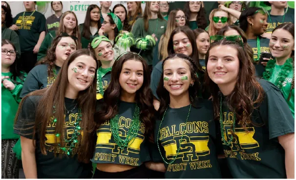
The rebranding also included reimagining and standardizing Dighton-Rehoboth's mascot, the Falcon. “That represents the district’s agility,” Runey explains, “our ability to move fast and meet ever-changing student needs.” Before the rebranding, the high school’s sports teams were using borrowed logos from Boston College, the Atlanta Falcons and the Iowa Hawkeyes, creating confusion and copyright issues. To further drive home the district’s unity, Dighton-Rehoboth had to ensure all its clubs and athletic programs adopted the Falcon’s fierce new look.
If the interlocking letters referenced the district’s strong past, the revitalized Falcon—the fastest animal on Earth—now represented its agile future.
“We Are DR”: Consistent District Communications
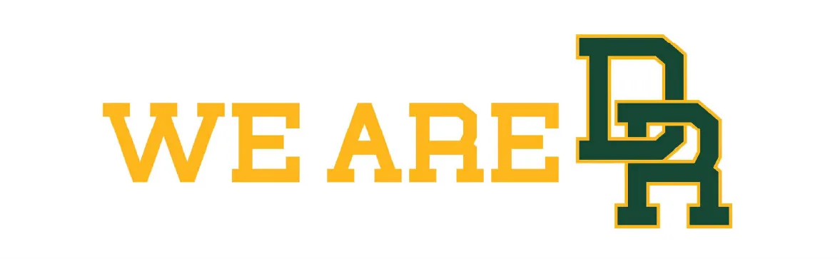
But visual rebranding only goes so far. Runey needed to communicate what the new strategic plan and logo actually meant for folks. “Those three core principles—Empower, Ignite, Shape—and the hashtag #WeAreDR are the foundations of basically everything we push out,” he says. “We try to do as much with the ‘DR’ as possible, to remind people that we are one district.”
Without a dedicated comms person on staff, Runey personally writes or edits most of the district’s media releases. “Nothing at the district level goes out until I see it,” he tells us. At the school level, principals take the lead on messaging, “but we have conversations about making sure that we all have the same hashtags, that we're rooting as much of the verbiage in the strategic plan as possible,” he says.
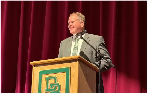
Runey himself began to regularly appear before each town’s select board with updates, always wearing a green tie and an interlocking "DR" pin. He started attending the Cow Chip Festival, craft fairs and agricultural fairs with his family. “I needed to be visible and accessible as the face of the district,” Runey says. “People needed to see that my family, my team and I were committed to being active members of the community.”
This visibility extended to media relations. Whenever something good is happening at the district, Runey pushes out a press release—taking care to include those core values and the #WeAreDR branding. For example, when local media covered declining enrollment across Massachusetts, Runey proactively reached out to discuss how Dighton-Rehoboth was reversing that trend.
“We have actually had an increase in enrollment, especially in our CTE programs,” he explains. “Largely on life support” when Runey arrived, Dighton-Rehoboth’s seven vocational pathways have been revitalized under his leadership, and now, the district is looking to add three more. Families who might have chosen a traditional high school are now coming to Dighton-Rehoboth for these programs. But those who might have chosen a vocational technical school “can also come to us and get high-quality band, music, theater, art and athletics,” says Runey—things the vo-techs don’t offer. “We have the complete package,” he says.
Because he reached out, Runey got the opportunity to talk about the encouraging trend—and the district’s CTE programs—in a studio interview. Now, “I'm on speed dial for a lot of the Providence and Boston stations, because of my availability and the fact that I push out so many press releases,” he says. “The goal was never publicity for its own sake. It was about rebuilding trust in public education by consistently highlighting what was going right across the district. Without a culture of positivity, difficult moments can feel like a bowling ball dropped into a bathtub. But with it, they’re absorbed like a marble tossed into the ocean.”
The interlocking letters followed Runey everywhere: on his lapel pin during TV interviews, on banners at community events, on the hats he wore to local stores. The point was to make the man inseparable from the brand, and the brand inseparable from the message: two towns, one district, unified in purpose.
Rebuilding Trust
What makes Dighton-Rehoboth’s rebranding so special isn’t the design work or the strategic implementation. What’s remarkable is the genuine transformation happening underneath. It’s not just the enrollment gains or the success of the vocational programs, but the connections the two towns now have to each other—and more importantly, to their regional school district.
“There really is a renaissance going on in our district,” says Runey. “Community members are starting to believe in the district again. We have a good relationship with the police and fire departments, with the select boards, with the town administrators. There are times where we're not going to agree on certain things—but there's a level of respect and positive momentum. It's changing the narrative about the entire district.” And what is that new narrative? Two letters, connected. Two towns, unified. One school district, reborn.