10 Tips for K-12 ADA Website Compliance
Ten tips that ensure your school district website meets ADA website compliance standards.

In the digital age, your app or website needs to provide a great user experience to everyone in your community—including people with disabilities. But most school leaders are in the dark about whether their website complies with the Americans with Disabilities Act (ADA), which requires that school websites be accessible to anyone, regardless of disability. If schools are found to not be ADA compliant, the Office for Civil Rights could be contacted and an investigation could be opened concerning your school.
After doing extensive research on the ADA, analyzing the Web Content Accessibility Guidelines (WCAG), and speaking with over a dozen representatives from the OCR, we have compiled a list of the top ten tips for ADA website compliance. While these tips do not cover every single way to be ADA-compliant, we’re confident that this guide will set you in the right direction and help you avoid most ADA complaints.
Click on any tip to jump right to it!
- Step 1: Make Text Legible
- Step 2: Make Navigation Accessible
- Step 3: Format Text for Screen Readers
- Step 4: Label Images with Alternative Tags
- Step 5: Use Contrasting Colors
- Step 6: Make Downloadable Content Accessible
- Step 7:Provide Captions and Transcripts for Video and Audio Content
- Step 8: Format Tables for Screen Readers
- Step 9: Keep an Up-To-Date Accessibility Policy
- Step 10: Ask Questions/Meet with Your Team
1. Make Text Legible
When you look at your school website, is the text easy to read? Are there any distracting or illegible fonts?
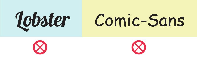
Text on your website should be legible and easy to read. Choosing fonts like Comic Sans or Lobster could make reading difficult for your audience, especially someone with low vision. It might seem trivial, but font size and selection can be a deciding factor in whether or not your website is a high-quality experience for all.
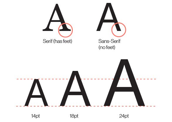
We recommend using a sans-serif font on your website. As for size, your normal text should be 14 to 18 points, while your titles should be about 24 points. These small details can help someone who can’t read very small text, which gives your website a better user experience for all your students and community members.
2. Make Navigation Accessible
People who have motor disabilities (or even people with broken laptop touchpads) navigate websites with their keyboards. This is done simply by using the tab and arrow keys to reach a desired destination. However, some websites have “menu traps”—menus or pop-ups that cannot be closed without the click of a mouse. For someone using tab and arrow keys, a menu trap can make the user experience unsatisfactory and challenging. You should be able to tab through a website with little to no issue.
The WCAG also recommends that clickable buttons and icons be at least 150x150 pixels, about 9mm in each direction. This creates a larger touch area, allowing users with motor disabilities to easily press their desired selection if they have access to a touchpad.
3. Format Text For Screen Readers
Some of your users might be visiting your site with the help of screen readers, helpful tools that read website contents aloud for visually impaired users. To make sure you’re including these members of your community, you should organize your website’s text in a logical way, so that a screen reader can easily process your content. Go through your web page and check that headers, sub-headers, and paragraph text flow in the right order.
Here are some other helpful tips that will make screen readers’ jobs easier:
- Links should always state their destination. For example, say “Click Here for More Info” instead of just “Click Here.”
- A screen reader will read verbatim what you display on your website, so being as clear as possible is a must.
- Using animations to replace any major content on your site can make a screen reader’s job impossible since there is little to no text for them to describe in the animation. It’s best to steer clear of using motion graphics so that everyone in your audience can enjoy your content.
Since screen readers read everything in order on a website, we recommend making sure that navigation menus are skippable. This will allow your user to find the information they’re looking for faster.
4. Label Images with Alternative Tags
Alternative tags (or alt tags) are written descriptions of images coded into a website’s HTML. When screen readers read the contents of a website aloud, they can read these descriptions, allowing visually impaired users to experience your images. Alt tags provide a description of an image in case your website has problems loading.
As you write alt tags, be as descriptive as possible. Provide the names of individuals, places, and objects. The more descriptive you are, the better your audience will be able to understand your content.

5. Use Contrasting Colors
After you make sure the text is legible and made clear to your audience, look at your website’s colors. How easily readable is the text you’re presenting? Do some color combinations on your website make reading difficult?
Not only is it important to have legible fonts, but the background color and font color your website presents could make or break your user’s overall experience. The colors of your website could especially affect colorblind users, who can only see certain colors or not see any color at all. Having a bright yellow font displayed against a white background could make reading difficult for anyone, so it’s best to pair colors that contrast each other.
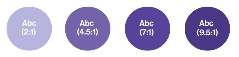
The WCAG recommends you maintain a color contrast of at least 4.5:1 or greater on all text, but 7:1 or greater is ideal. For example, white text displayed on royal blue is easy to read. Black text on a white background is always a good go-to color combination as well.
To test your color contrast on your website, WebAIM offers a free tool that checks for you. Follow this link to check it out!
6. Make Downloadable Content Accessible
Any school district’s web page includes links to documents about everything from sporting events to lunch menus. You know better than us that school districts are required by law to include information like accountability plans and school board agendas on their websites. More often than not, it seems easiest to display these documents as simple PDFs. However, since they’re often displayed as images, PDFs can be indiscernible to screen readers. They also pose a huge problem for users who don’t have the plugins or software to open a document.
To remedy the situation, any document on your website should have its viewing requirements listed, be clearly labeled, and offer more than one file type. Having a text-based alternative, like a Microsoft Word Doc, can allow all of your users to understand the same information.
7. Provide Captions and Transcripts for Video and Audio Content

Videos have become powerful tools for sharing information and communicating with the public, so making sure everyone can enjoy them is a must. The ADA requires that all videos and audio clips on a website include captions or a transcript, allowing deaf or hard-of-hearing users to have a full user experience.
For example, if you’re using a YouTube video anywhere on your site, YouTube can automate closed-captioning for videos on their platform. The company uses a software program that listens to each video and translates it into text. Any automated service like this could generate some errors, but you can fix them quickly and easily by editing their version.
The same principle goes for audio content, like podcasts: if you use them, provide a transcript.
8. Format Tables For Screen Readers
While data tables can be great ways to organize information, they can be difficult for screen readers to understand. When using data tables, make sure that they’re clearly labeled, proportional to the screen, and simple to understand. Screen readers can easily read off the information if every cell in the data table is labeled, and all the information is in its corresponding data set.
Leaving anything blank in a data table can disorient a screen reader (which is reading the information in the order it’s displayed), leaving your user feeling frustrated and confused. Even if there isn’t information available, a simple placeholder like “N/A” can offer your user some clarity.
If you or your school webmaster are having problems with using tables throughout your website, it might be best to avoid them altogether. Most of the time, you can display information in paragraph form, without a data table.
9. Keep an Up-To-Date Accessibility Policy
An accessibility policy is a statement that shows an active commitment to maintaining ADA website compliance. It usually pinpoints a contact person in your school organization for people having issues using your website, mitigating any reason for a community member to send a complaint to the OCR. Most importantly, having an accessibility policy shows your community that you care about providing a great user experience for all.
In addition to providing an accessibility policy, we recommend including a form where community members and students can report any issues they come across. This option not only allows another channel for concerned citizens to relay their concerns but also allows your team to identify and resolve these internally.
10. Ask Questions/Meet with Your Team
ADA website compliance might seem like an uphill battle, so it's best to work with your team to make sure your school district has an ADA-compliant web design. Meeting regularly, discussing ADA accessibility, and checking your school website with your team are great first steps in staying ADA compliant.
Additionally, reach out to your website host if you have any questions or concerns! They should be more than willing to work with you to make your website ADA-compliant.