
Since technology has taken center stage in how school leaders communicate within a school district, your school website needs to be accessible on the devices people use most: their smartphones. This is why having a responsive website is critical in 2022. So, what is a responsive website?
To learn more about responsive school websites, let's address some common questions about the subject and explain how Apptegy makes school websites responsive for our clients.
Q1. What are responsive school websites?
A responsive school website is a website tailored to be viewed on multiple devices. It is optimized to look good on your desktop, iPad, Android, tablet, smartphone, or any device where people might access your school’s web content.

Q2. Why are they important?
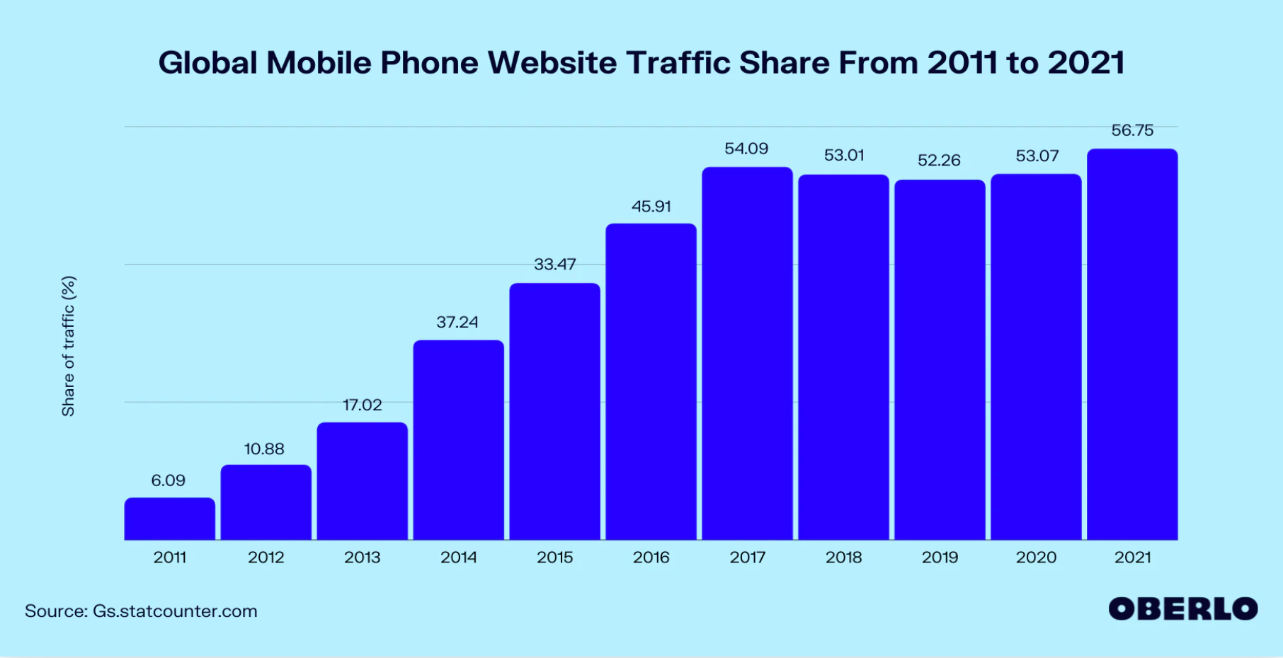
In the first quarter of 2021, about 57% of all web traffic users came from mobile devices. Keeping in mind, tablets are excluded from this percentage. Not only that, but desktops, laptops, and mobile phones come in all different sizes, resolutions, and displays.
With mobile usage increasing and a vast assortment of devices now available, it’s important to make sure your website can be viewed on any device that can access it. You’re ensuring that everyone can look at your school’s website by making your website responsive.
 Q3. How does everyone in the community view the school’s website?
The faculty, the people that are typically building and accessing the school website, are almost always using desktops. Having said that, I think community members, parents, students, and people who are just looking for general information—they’re either accessing the school’s website from a mobile browser or looking at it from other avenues, like social media or an app.
Q4. What devices require websites to be responsive?
iPhones (old and new models), tablets, Androids—any device that gives your users access to your content. Supporting the flagship Android and IOS device shows your community that you care about keeping up with the times.
However, it’s less about the devices themselves and more about their sizes and resolutions. We have to think about devices’ screen resolutions, starting with the lowest on the market. It’s really focusing on an array of resolutions and making sure your content looks good on all of them.
Q5. What are the benefits of having a responsive school website?
The biggest benefit is that you’re on par with what other people are doing. You’re presenting your content in a way that makes sense to your audience. You’re also showing your users that you care about them, because in making a responsive website, you’re thinking:
What does the mobile user need?
How can I make it easier for them to navigate our menus?
How are they seeing my online content?
What devices are they using to see my online content?
By making things easier on your users, you’re giving them a great online experience.
Q6. Does it matter if you have a non-responsive website?
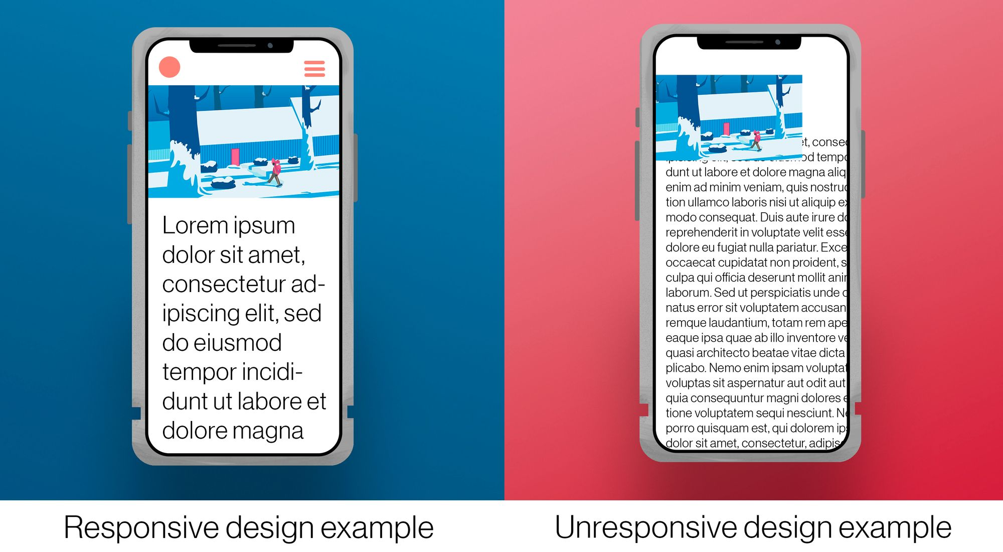
A non-responsive website is a terrible experience for your users. Text can be very small on an iPhone, and depending on how the site was made, you might not be able to pinch to zoom to see that content, causing a user to leave your school’s web page. If people can’t easily find the information they want, they’ll go somewhere else.
Not only that, but your website will look very different from almost all other webpages. More and more, websites are moving towards being responsive; if yours isn’t, it’s obvious.
Q7. What’s the easiest way to see if your website is responsive?
Probably the easiest way to see if your website is responsive is to take a look at it from both your desktop and mobile phone. Ask yourself:
When you look at your phone, does it feel different?
Are the text and images different sizes on mobile than on desktop?
Do you have to “pinch to zoom” to see everything on the phone?
If you’re looking at the site on your desktop, you can also change the size of your browser window, and see if your content changes with it. If your content doesn’t shift to fit the window size, your site isn’t responsive.
Q8. If your website isn’t responsive, what should you do?
If you see or hear from community members that the school’s website isn’t responsive, you can start the conversation by saying to your vendor,
I feel like we’re ignoring parts of our community and user base. How can we make this website more adaptive to the different people accessing it? What devices are we currently supporting?"
Your website should be a statement about your identity, so if you think users are being left out of that experience, it’s important to communicate that concern with your vendor.
Q9. What’s the point of getting an app if you have a responsive website?
While a responsive website is great to have for people who aren’t ready to commit to your school district, a mobile app is built for parents, community members, and students who are engaged in your district.
By having a mobile app, you’re reaching community members where they are most: their smartphones. According to eMarketer, the average person spends 90% of their mobile time in apps versus the web. People who have your app downloaded are able to quickly read and access important information, like the dates of upcoming teacher conferences or the next day’s lunch menu.
An app allows your community to have a specific place to access your school’s information, while a responsive website is more for people generally interested in your school and can be a place to house necessary forms, like government documents.
For more information on the importance of a school mobile app, check out our guide on Building a Mobile Strategy here.
Q10. How does Apptegy ensure that each school district’s website and app are responsive and effective?
At Apptegy, we do our research. We look at different screen breakpoints, making sure your school’s content can be viewed on desktop, mobile, or tablet.
From there, looking at a school’s pre-existing content, we think:
What type of content is here?
How can we make it responsive?
What should we be doing differently?
Building responsive websites isn’t difficult—it’s just about making sure that a school’s content is adaptive. All the components of Apptegy’s sites were created with responsiveness in mind.
After a client’s website and app are live, we make sure the website stays responsive. We look to see if it is adapting to new web standards and trends. We also stay on top of the newest website browser versions and devices, and make sure our sites remain accessible everywhere. In essence, we take a proactive approach to make sure all of our school website designs are responsive and effective.
For us at Apptegy, making a school website isn’t a one-time transaction. We take pride in building a relationship with our clients, and part of that relationship is a consistent focus on the needs of each district’s community, parents, students, and faculty. We want your website and app to be as responsive as it needs to be.